Sicoob:three productsbuilt from scratch
At Sicoob's innovation lab, I designed the Pix app, Sicoob Poupança and Sicoob Moob end to end. All three are still in production.
UX/UI Designer
Pix, Sicoob Poupança and Sicoob Moob
Research, visual identity, UI and testing
Hybrid apps (Ionic) and back office
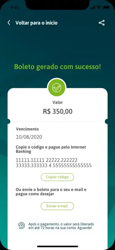
One of Brazil's largest cooperative financial systems needed digital products for audiences with very different levels of comfort with technology.
In the innovation lab, I designed three new products end to end: the Pix app, Sicoob Poupança and Sicoob Moob. Research, visual identity, UI, testing and implementation follow-up.
One innovation lab, three products from scratch
From 2018 to 2021, I worked at the innovation lab serving Sicoob. All three products shared one challenge: turning the needs of people with very different digital skills into simple interfaces, bridging users and the business.
Before designing, measuring whether the product made sense
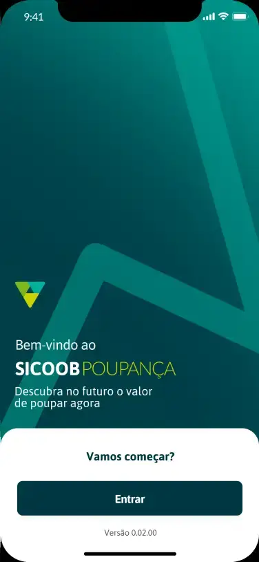
Part of Sicoob's base only used savings and had an internet bank with very few features. The idea was an app to move invested money and follow its growth.
I wanted to know if the product had real potential. We sent a digital survey to 5,000 people in the target audience and got 292 responses in one week: they could not move money online and had chip cards the project would support. The survey changed decisions across every area involved.
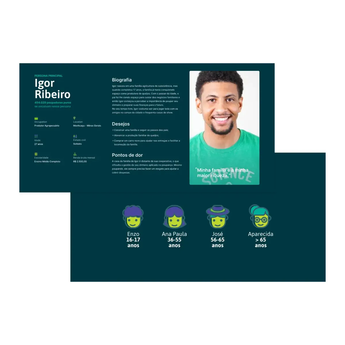
From the data, I created one main persona, aged 18 to 35, and four secondary ones that guided the team's decisions.
Testing before launch
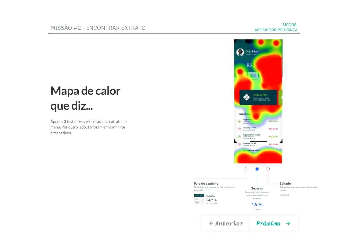
Since this would be these customers' first contact with Sicoob's digital services, I tested four paths remotely on Maze with 84 people matching the persona. Tests revealed unnecessary menu buttons and confusing terms. The flows, on the other hand, did well, with an average usability score of 65%.
The decision: keep the clean style and the one question per screen forms, which performed best, and cut what confused people.
A channel that makes members feel like owners
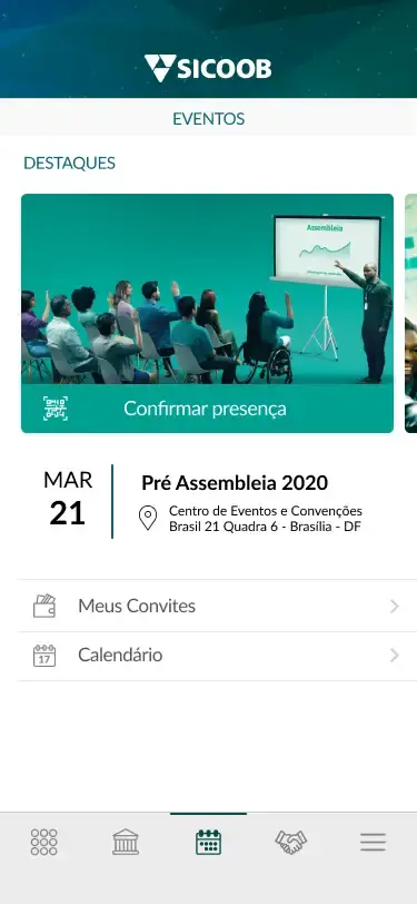
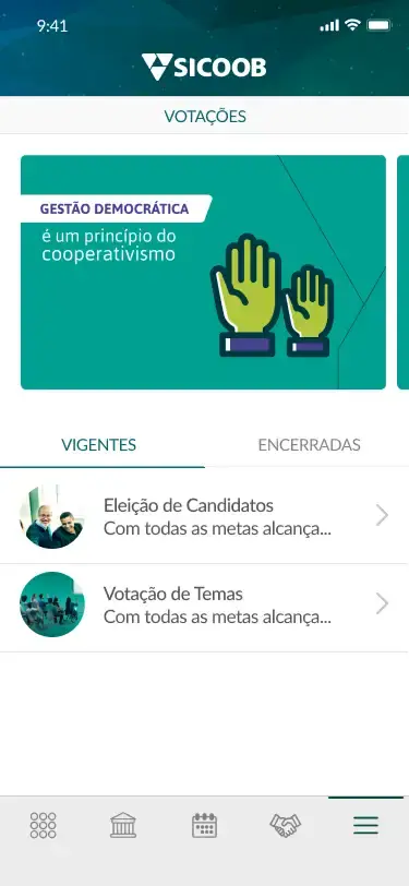
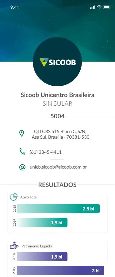
With communication going digital, Sicoob needed to keep members close to their cooperative. Moob was born as a relationship channel: news, events, assembly voting and cooperative life in one place.
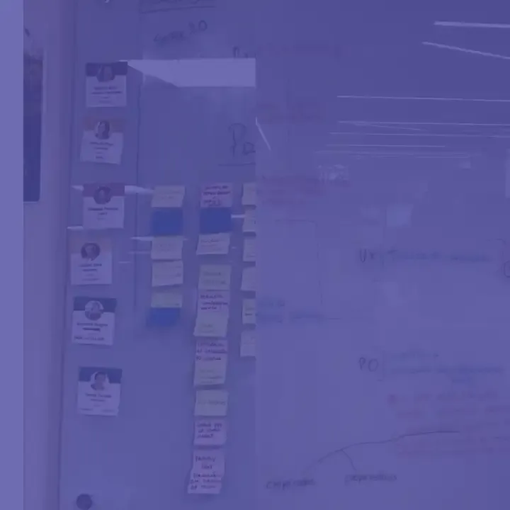
The project needed an identity to present to the board. I proposed the name and the brand, and it was approved unanimously. Then came the persona, flows including the back office, and many whiteboard wireframes before the UI.
The test that almost did not happen
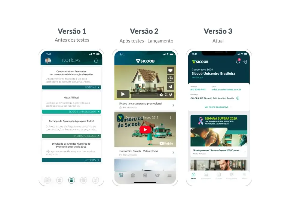
The deadline was tight and everything pointed to launching untested. I negotiated a format that would not slow the team down: a moderated field test before launch and another in the first weeks. In total, 74 people, members and staff who serve the public.
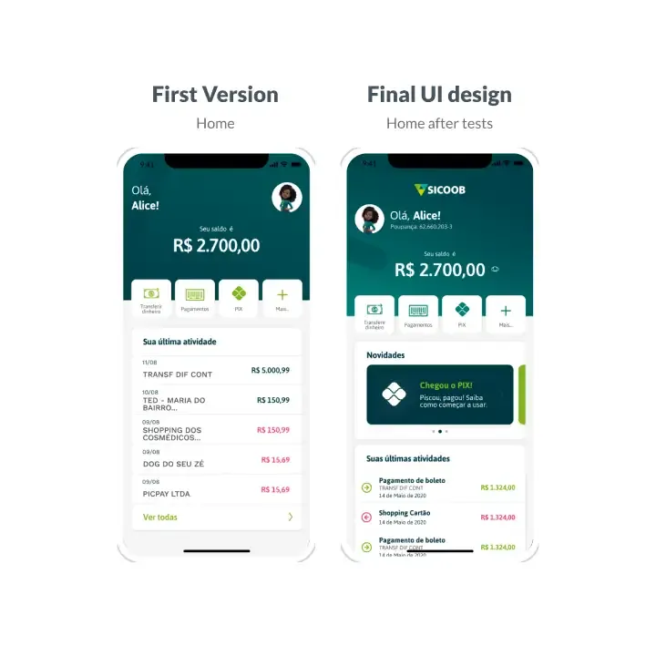
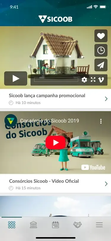
The tests changed button positions, information hierarchy and copy. In the final UI, I kept a clean style that always highlights the main object on each screen, with splash animations and feedback that users praised.
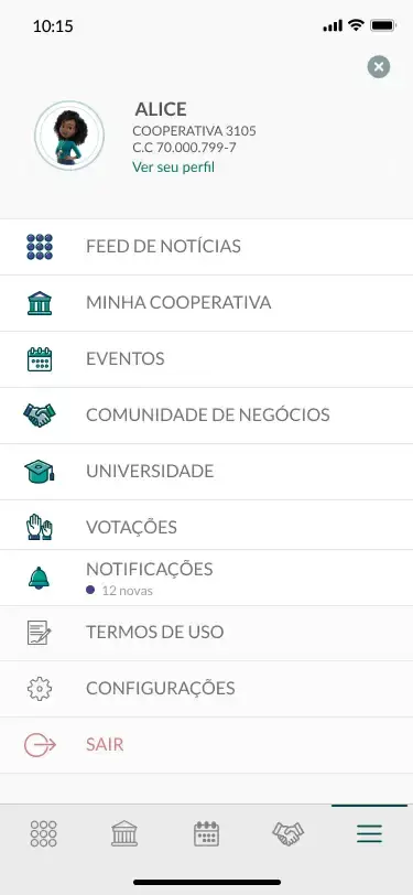
The Pix app, also from scratch
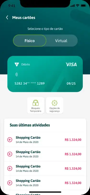
At the same lab, I designed Sicoob's Pix app with the same cycle of research, prototyping, testing and implementation follow-up with Product and Engineering. It is still in production.
Three products still live today
Few features for savings-only customers, and members distant from their cooperative.
Three products in production, with national adoption and industry recognition.
The project that taught me the most
- I work with people, not screens. In Moob's field test I heard complaints, praise and plenty of "no". That is where it clicked.
- Testing fits any deadline if the format is designed not to block the team.
- Simplicity has to be proven. One question per screen looked slow on paper and worked best for people new to digital.