BB Digital PF:from the developerto the end customer
How we modernized Banco do Brasil's web self-service, used by 2.07 million people, and why that meant redesigning the journey of the teams who build the platform too.
Role
Senior Product Designer and UX Tech Lead
Team
Web PF squad, business lines, BBDS and 40 designers
Scope
Research, IA, UI, design system, DevEx and AI
Platform
Responsive web, Angular DLS
bb.com.br/apf
The new home page: shortcuts to the most frequent tasks, balance, cards and support widgets, and the contextual menu.
The problem
A legacy channel with technical debt, outside the bank's design system (BBDS), and a menu where 70% of people could not find what they needed.
What I did
I led the research, designed the new architecture with hubs and widgets, and the version coexistence model. On the inside, I redesigned the journey of the teams who build the channel, with UX from day one and AI-assisted review.
Before → after
Before: 70% could not find functions in the menu.After: in tests, people completed their tasks without getting stuck, and teams created 133% more apps per semester.
01 · Context
A channel for 2.07 million people that no longer kept up with the bank
BB Digital PF is Banco do Brasil's web self-service for individual customers. The channel carried technical debt, was out of step with the bank's other channels, did not use the BBDS design system, and every feature behaved in its own way.
For customers, that meant trouble finding things, a dated interface, long flows with no autofill, errors with no guidance and no personalization.
bb.com.br
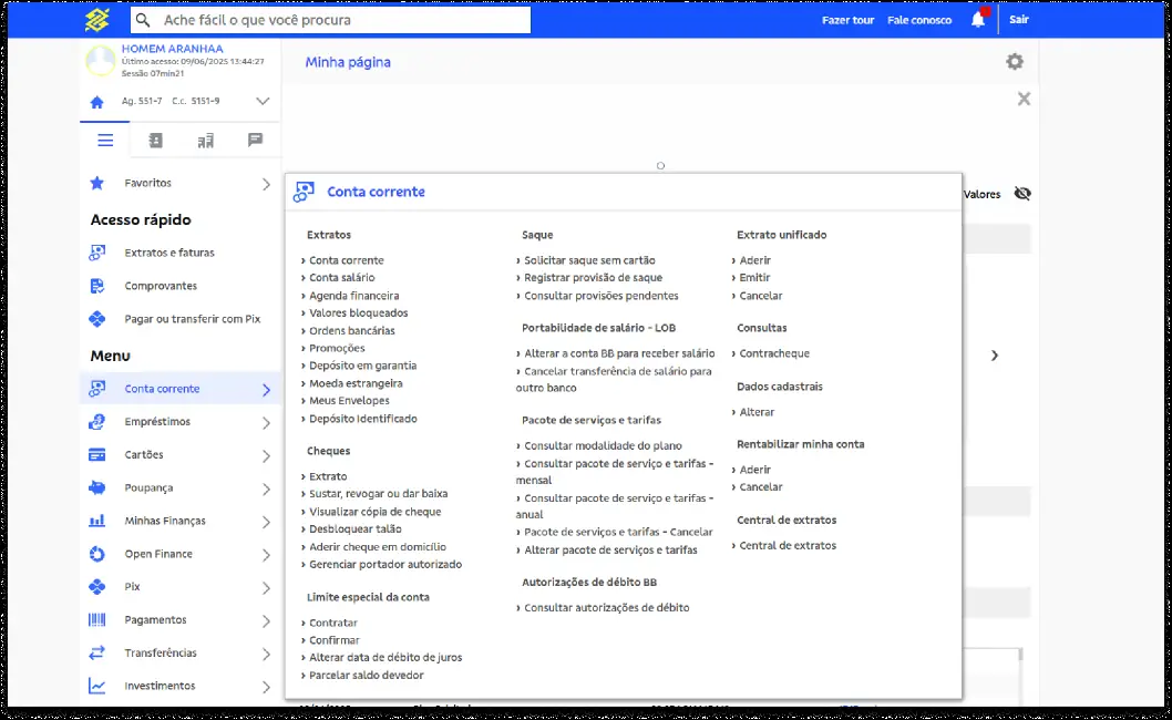
Dozens of options on the same level.
bb.com.br
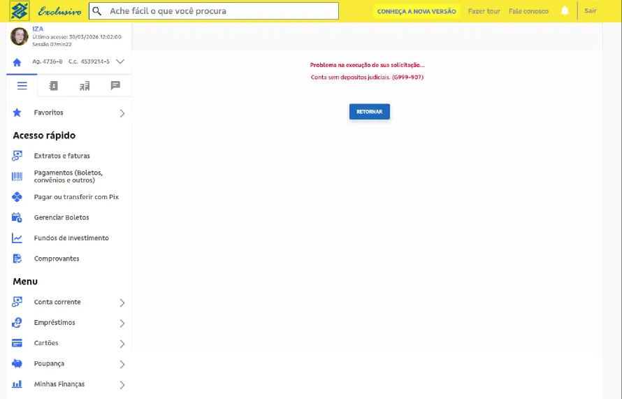
An error with no explanation and no way forward.
Who we were designing for
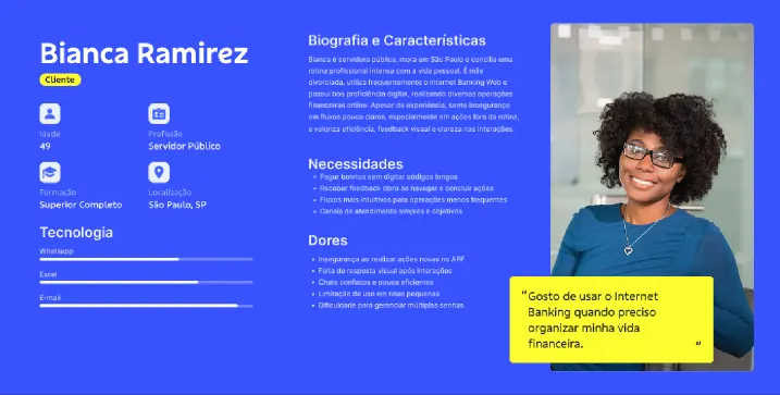
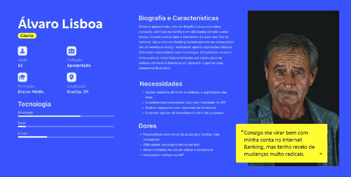
Most users are mature adults aged 41 to 60, with a significant share over 60, a conservative financial profile and strong institutional ties: civil servants, retirees, pensioners and salaried employees. Two personas guided the decisions.
02 · Research process
I turned a vague brief into a question we could measure
The ask was "modernize the channel". I reframed it as something testable: can people find and finish the task they came to do? From there, research ran on two parallel tracks.
Studies
Discovery and benchmarking
Scope proposal
Version coexistence proposal
Home page accessibility checklist
Information architecture: navigation, menu and search
User testing
Home page usability
Statement and payments
Switching between versions and onboarding
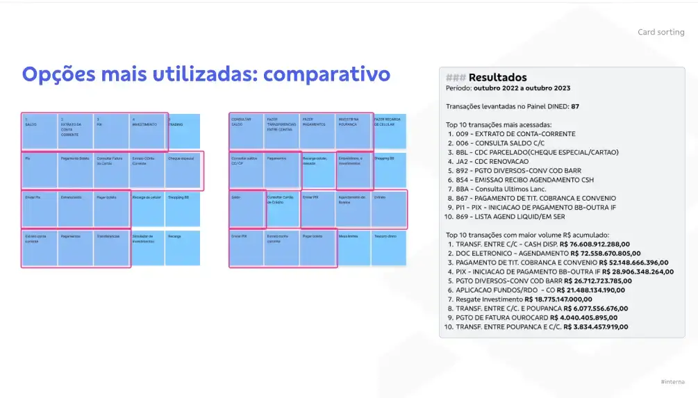
Card sorting for the architecture
Menu and information architecture
Personalizing quick access and the home page
11in-depth interviews
8usability tests
1card sorting
23desk research studies
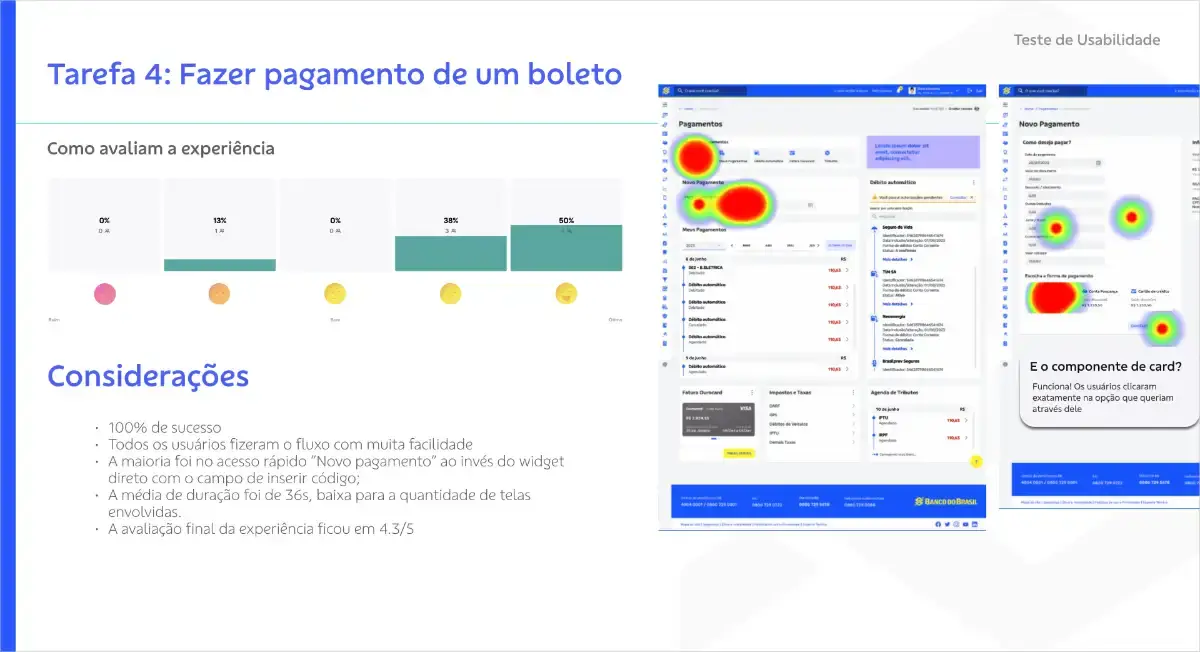
The finding that changed the project: 70% of people could not find functions in the legacy menu. Heatmaps concentrated on detailed statement and new payment. Benchmarking Nubank, Inter, Mercado Pago, PagBank, Bradesco and Caixa showed compact menus and shortcuts to frequent actions beating crowded menus.
03 · Information architecture
A crowded shop window confuses. An empty one says nothing.
I presented each hub as a shop window: the essentials are on display and invite people in. With that image, I aligned the business areas around three ideas:
Hubs: group services around one subject, such as Payments or Cards.
Widgets: blocks with built-in features and flows, one click away.
Context: a feature shows up for whom it makes sense. Cashback only for eligible transactions, pension statements for plan holders, transfer type chosen inside the transfer flow.
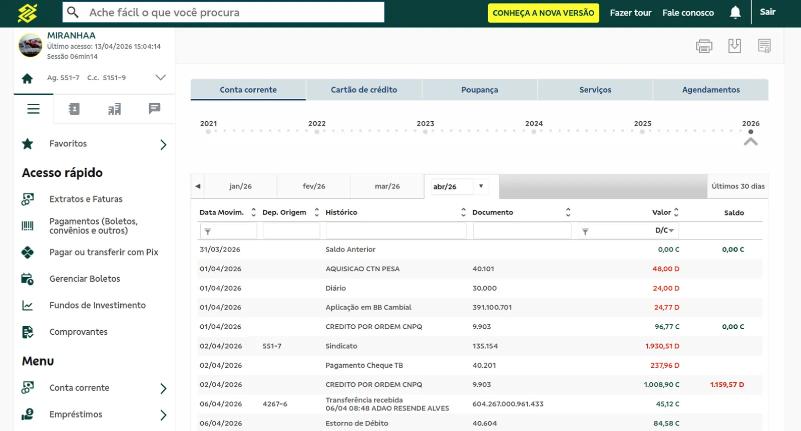
Before
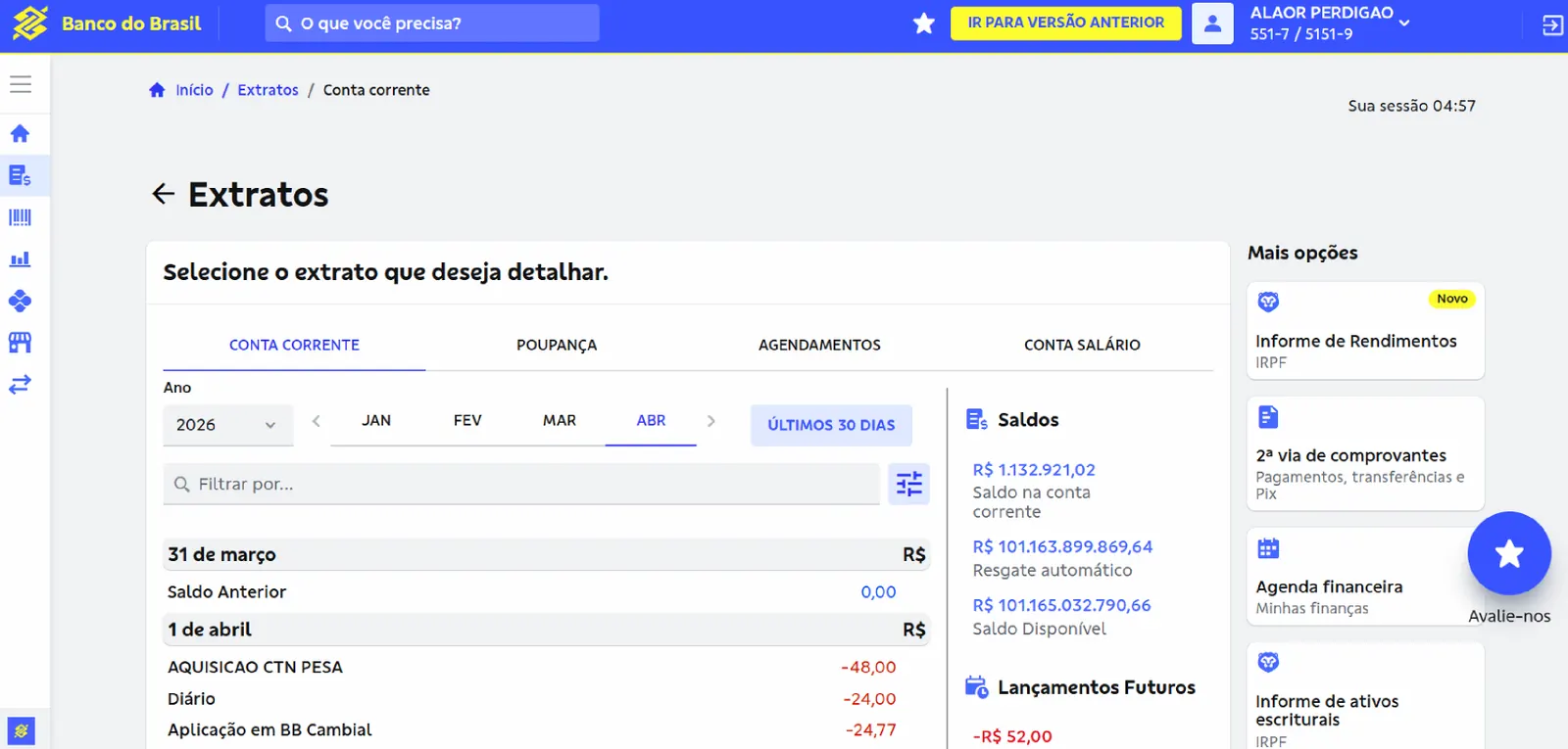
After
Statement before and after: period filters at the top, balances alongside, and related actions such as the income report and duplicate receipts in context.
04 · Decisions
Four decisions that shaped the product
Decision 1
Hubs and widgets instead of a hierarchical menu
Evidence
70% could not find functions; heatmaps focused on statement and payment; compact menus performed better in benchmarking.
What I ruled out
Just reorganizing the legacy menu. It would keep the hierarchy that caused the problem.
Trade-off
Requires governance so each business line places its feature in the right hub.
Decision 2
Predefined widgets that people reorder and hide
Evidence
Engineering, involved from the first sketches, raised a real performance and maintenance risk on the legacy system.
What I ruled out
Fully configurable widgets.
Trade-off
Less freedom to personalize, in exchange for something feasible and easier to understand and maintain.
Decision 3
Home page decided by evidence, not hierarchy
Evidence
Cards, payments, consortium, insurance and loans all wanted the top of the page. I brought stakeholders to watch usability tests with me.
What I ruled out
Splitting the space by how much weight each area had in the room.
Trade-off
No area gets guaranteed prominence. The customer decides what comes first, through personalization.
Decision 4
Version coexistence instead of a single switch
Evidence
A critical platform used daily by millions of people could not stop to change its navigation.
What I ruled out
A big-bang launch.
Trade-off
Running two versions for a while, with "Try the new version" and "Back to previous version" always in view.
05 · On the inside
The customer experience starts with the people who build it
If the development journey is fragmented, the customer experience inevitably ends up fragmented too.
The new channel would be built by many decentralized squads. As UX Tech Lead, I also designed the developer experience: the Webworks platform and the app creation journey in the bank's developer portal.
Before
Many teams only brought in UX at pre-production review, which led to rework.
Confusing rule setup and unclear documentation.
Teams had to open a ticket to create an app, publish a menu and get UX approval.
After
Self-service: teams create the app themselves by picking the right template.
One up-to-date source of documentation.
UX comes in earlier, with preventive rather than corrective review.
Fewer tickets and 7 fewer steps from kickoff to deploy.
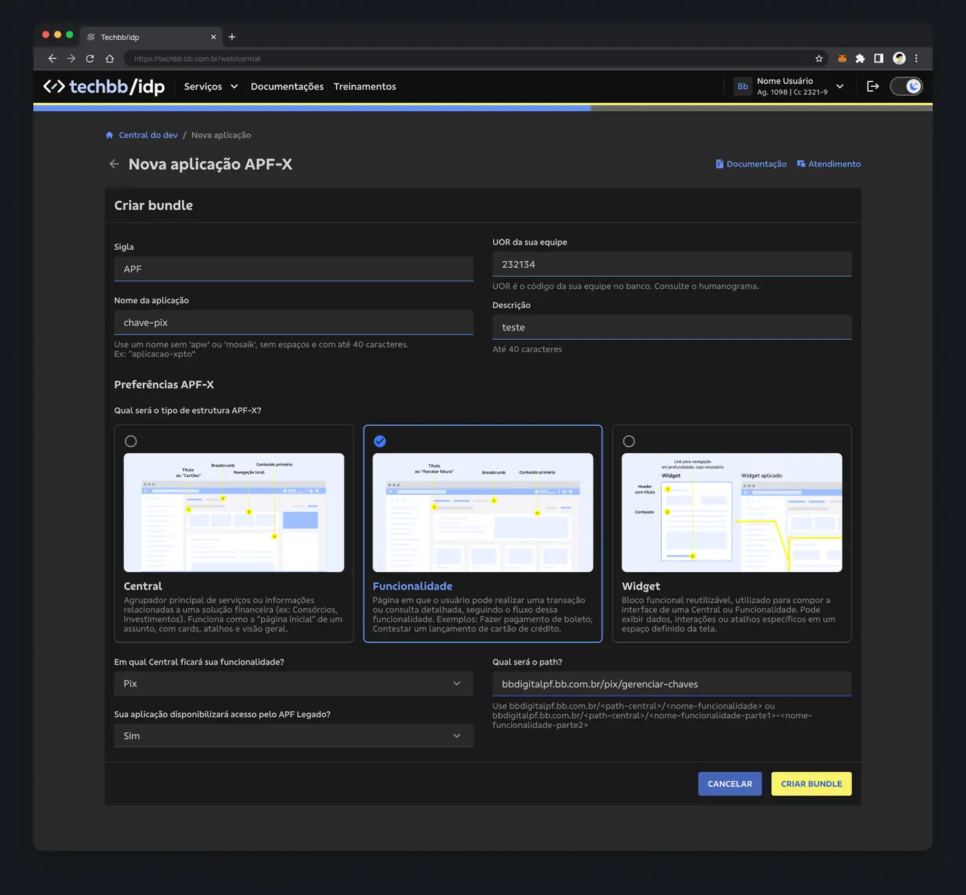
Creating an app: the team chooses whether it is building a Hub, a Feature or a Widget, and the portal delivers the right design system structure.
Governance without bottlenecks
With each squad's UX lead, I built a pattern layer on top of BBDS: UX templates, guidelines, tokens and variables in Figma, and accessibility documentation already solved, all published in the developer portal.
Developer portal · UX documentation
06 · AI-assisted UX review
A validator that reviews the prototype before it becomes code
Even with clear standards, UX review was a funnel: every screen went through someone on the governance team. I conceived an AI UX validator that reads the prototype straight from Figma and checks it against BBDS, the templates and the UX writing rules.
SubmitThe squad pastes the Figma prototype link.
ReadThe validator connects to Figma and reads the screens.
AnalyzeAn agent checks it against BBDS, templates and UX writing.
DiagnoseScore, issues by severity, impact and recommendation.
PipelineAbove 80% adherence, the prototype moves to production.
Demo with a test prototype: score 68/100, three issues found (one critical) and a recommendation for each.07 · Results and KRs
What changed, for customers and for builders
Before
70% of people could not find functions in the legacy menu.
→
After
In tests of the new navigation, people completed their tasks without getting stuck.
Main metric: task success rate. The new navigation shipped as an MVP, with the legacy screens running behind it, and each business line started building on top of it.
2.07Mpeople on the redesigned channel
+133%apps created through the new journey (27 → 63 per semester)
7fewer steps from kickoff to deploy
4,063unique users on the builders' platform (Nov 2025)
4.5/5team satisfaction (CSAT, 96 ratings)
5.4/7effort to create an app (CES, 327 responses)
R$547Kin total savings from the platform
80%minimum standards adherence to enter the pipeline
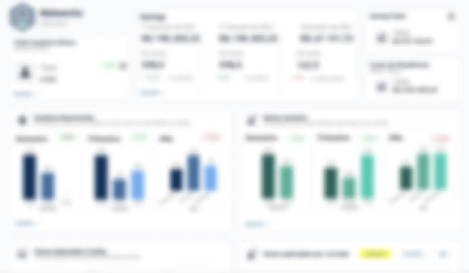
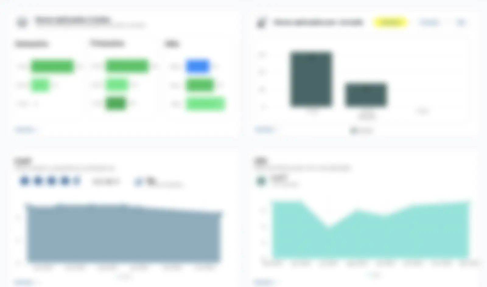
The metrics dashboard I designed for the platform. Blurred for confidentiality.
08 · Learnings
What I took away
Scale demands internal governance. In a product that reaches 2 million people, every squad building without standards becomes friction for the customer. The experience starts at home.
Navigation is about tasks, not menu trees. People look for what they came to do, not where a feature lives.
Alignment is won by showing the user. The fight over the home page ended when the business areas watched a real person look for their own feature.
What I would do differently: turn on production metrics from the very first rollout.