Oficina Reserva:from e-commerceto app
The first app for a menswear brand already strong online: benchmarking, MVP, an atomic design system published as a library and the UI for every screen.
Senior Product Designer
Figma and FigJam
Benchmarking, flows, design system and UI
iOS and Android
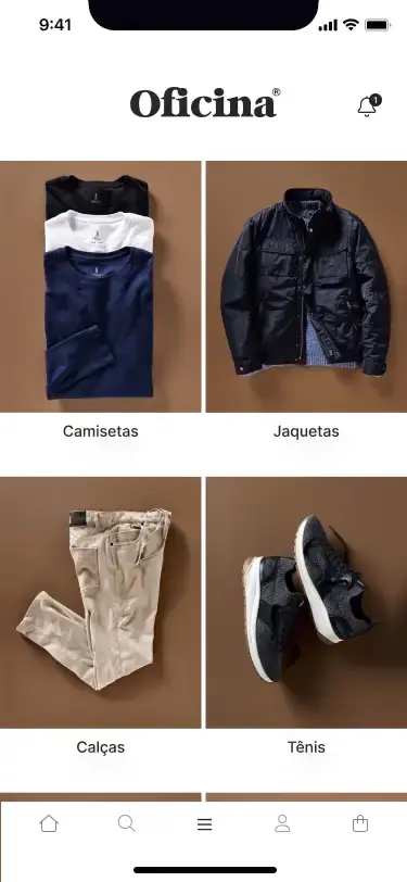
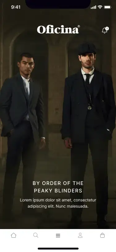
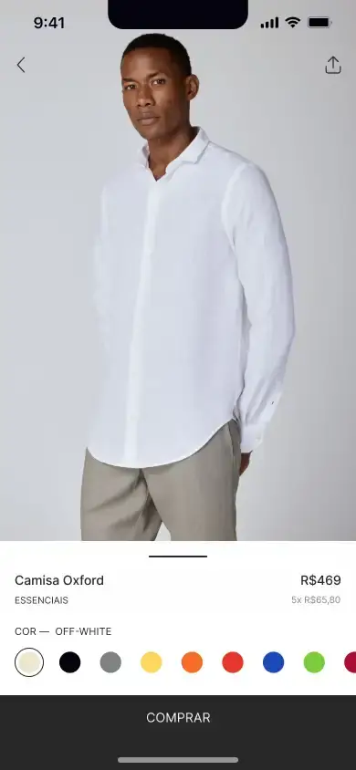
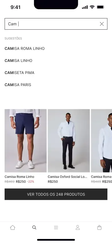

A menswear brand strong in e-commerce, with no app to bring customers closer and make mobile shopping simpler.
Benchmarking, MVP flows and wireframes, an atomic design system published as a Figma library, the UI for every screen and the handoff to development.
A brand ready to leave the browser
Oficina Reserva is a Brazilian menswear brand known for its modern look and quality. With strong e-commerce sales, the next step was an app to boost engagement, simplify buying and strengthen loyalty.
Discovery and product strategy were already set. I joined as Senior Product Designer to turn that strategy into a product: MVP definition, visual system and every screen.
How other brands speak to a male audience
I analyzed direct and indirect competitors looking at three things: the visual elements that position the brand, the components that highlight key actions, and the interactions that shorten the path to purchase.
Deciding the MVP before drawing the first screen
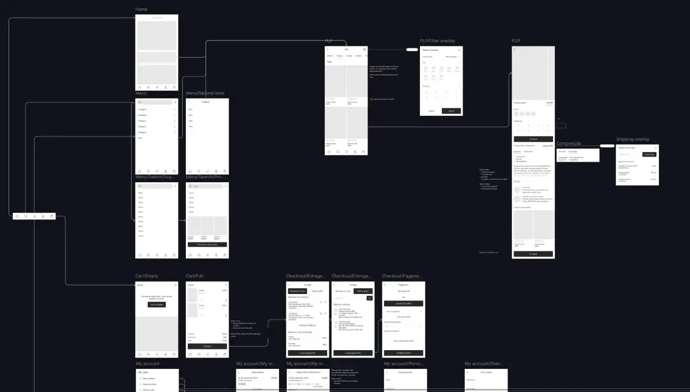
With the PO and the product team, I designed the app's flows and wireframes. That is where the MVP became clear: only what was essential to the strategy and to the shopper's needs.
An atomic system, published as a library
I built the design system on atomic design. Tokens for color, type and spacing at the base; atoms such as buttons; molecules such as form fields; and organisms such as navigation bars.
I published it as a Figma library, so every project file drew from the same source and every update reached all screens at once.
Every component designed for when things go wrong, too
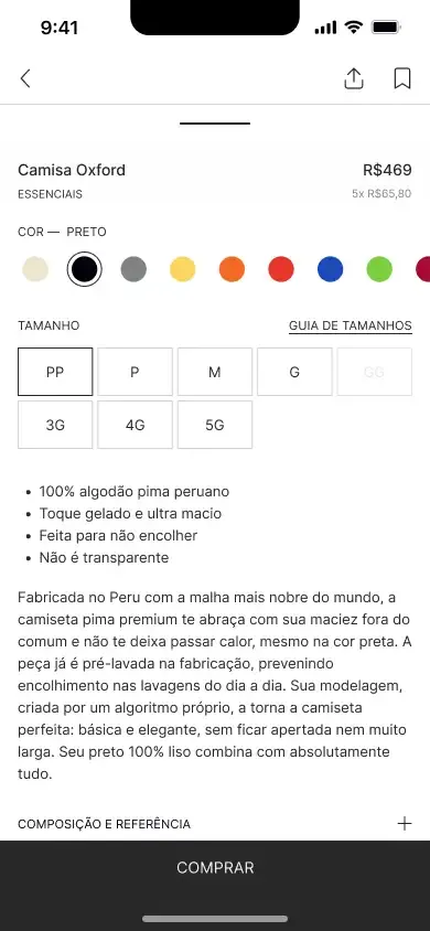
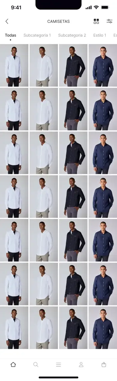
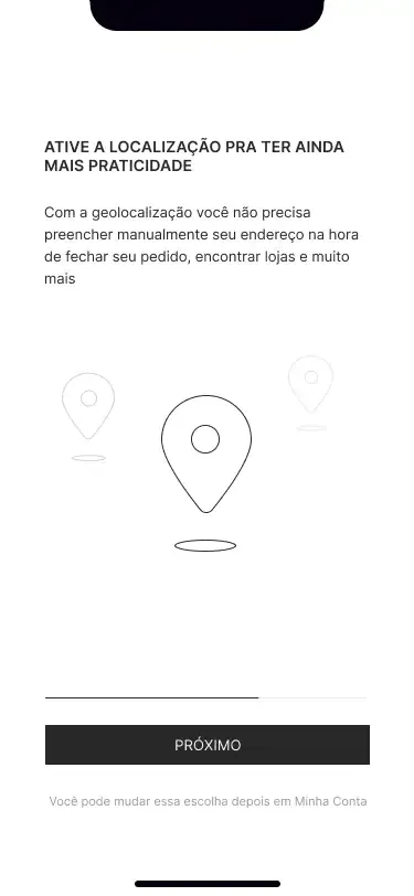
I organized screens by feature and designed the edge cases of every component: empty lists, errors, loading states and permissions. Each screen and interaction shipped with documentation and handoff, which kept the design intent intact through implementation.
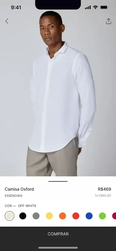
Launched in July 2024, in both stores
The brand sold only through its website.
A consistent app on iOS and Android, with strong adoption for a new product.
What I took away
- Craft lives in the details nobody asks for. Edge states are what separate a pretty screen from a product that works.
- System first, screens second. With the library published, every update became faster and more consistent.
What I would do differently: define analytics events together with the components, to measure each flow from launch.